I have received a private message about the layout of the collection page.
Quote
"Maybe try add some css styles. I writed few lines and it looks mutch better:"
I have no intention of changing the very simple Layout. The goal is the content, it is not about presentation to sell something.
It is a relative sensation anyway and changes with time. Take Windows 3.1, 95, then 7 mighty playful and colourful, now 10 rather dreary. Or take pages that are 20 years old. Nostalgia!
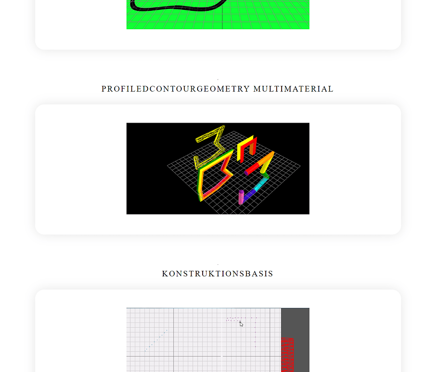
But only capital letters do not work at all.
I have to create the short terms from the content mostly by myself and have set the UppercaseLowercase without spaces as standard (there are exceptions).
Only capital letter snakes are difficult to read.
The separation left side picture (with link to discourse page at extended), right side short name and author gives with the dividing line a quick overview when scrolling the long page.
Dark and light themes are not necessarily pleasant for the eyes. Contrast is very high. I prefer a grey like #dedede